When paired with tagging, Map Rank Tracker becomes a powerful tool for businesses with hundreds or even thousands of locations.
Tagging lets you segment and organize campaigns by brand, region, business type, or any custom category, making it easy to track and compare performance across different groups.
This approach helps you quickly spot trends, take action on underperforming areas, streamline reporting for stakeholders or clients, and tailor views to fit your organizational structure.
Tagging campaigns for better organization
First of all, each business location requires its own campaign. Bulk campaign creation for a large number of locations is available via customer support.
Once campaigns are set up, you can tag them to group and track performance in ways that make sense for your business.
For example, if you're managing campaigns for three different companies, you can tag each group accordingly—“Company A,” “Company B,” “Company C.”
You can also tag campaigns based on other attributes, such as geographic area, business type, or any custom category that fits your reporting needs.
A single campaign can have up to 5 tags, so you’re not locked into just one segmentation strategy.
How to tag campaigns:
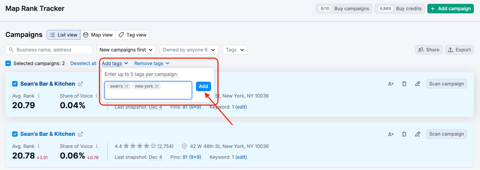
- Go to your Campaigns list
- Filter campaigns by criteria (e.g., company name)
- Select campaigns and press “Add tags”
- Enter up to 5 tags per campaign and press “Add”
Overview metrics in Tag View
Once tagging is set up, go to the Tag view tab to see consolidated performance metrics for each group.
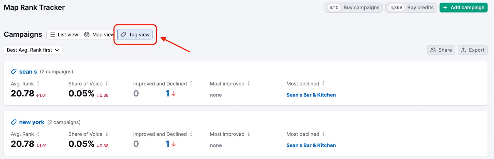
You’ll get aggregated insights per tag:
- Average Rank (average across all campaigns in the tag)
- Share of Voice
- Number of campaigns that improved or declined
- The campaign with the biggest ranking improvement
- The campaign with the biggest ranking decline
Visual insights in Map View
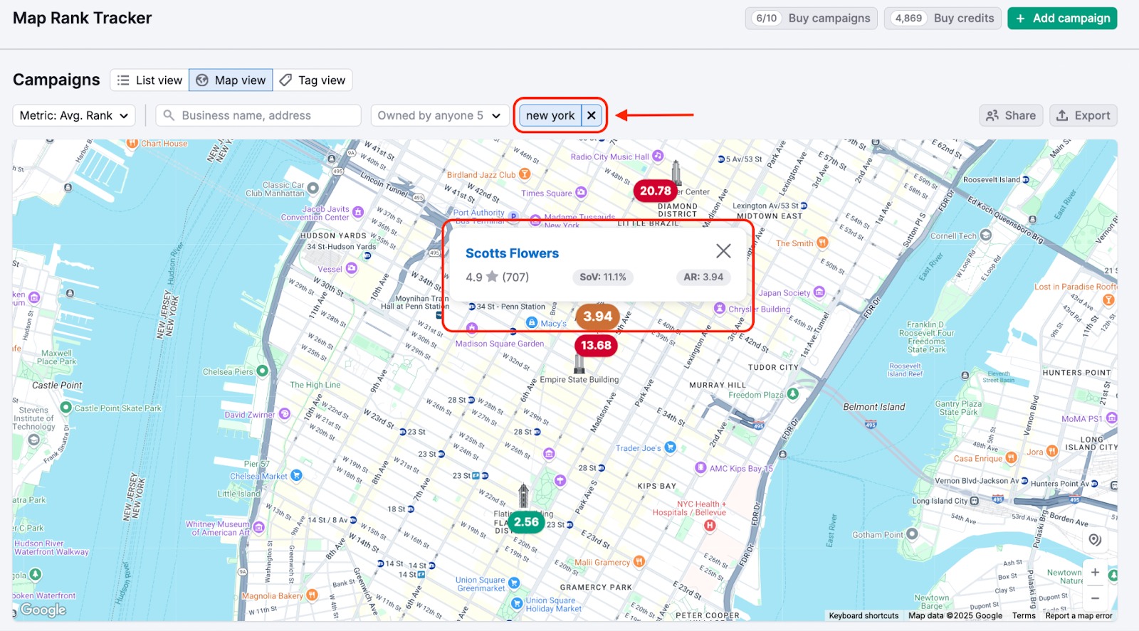
You can also use the Map View to analyze tagged campaign performance geographically.
Numbered markers represent individual business locations, where the number indicates the average rank for that specific business location. Clicking the marker opens a tooltip with business details: business name, star rating, number of reviews, share of voice, and average rank.
Pie chart markers represent clusters of campaigns that are located too close to each other on the map to be displayed individually at the current zoom level.
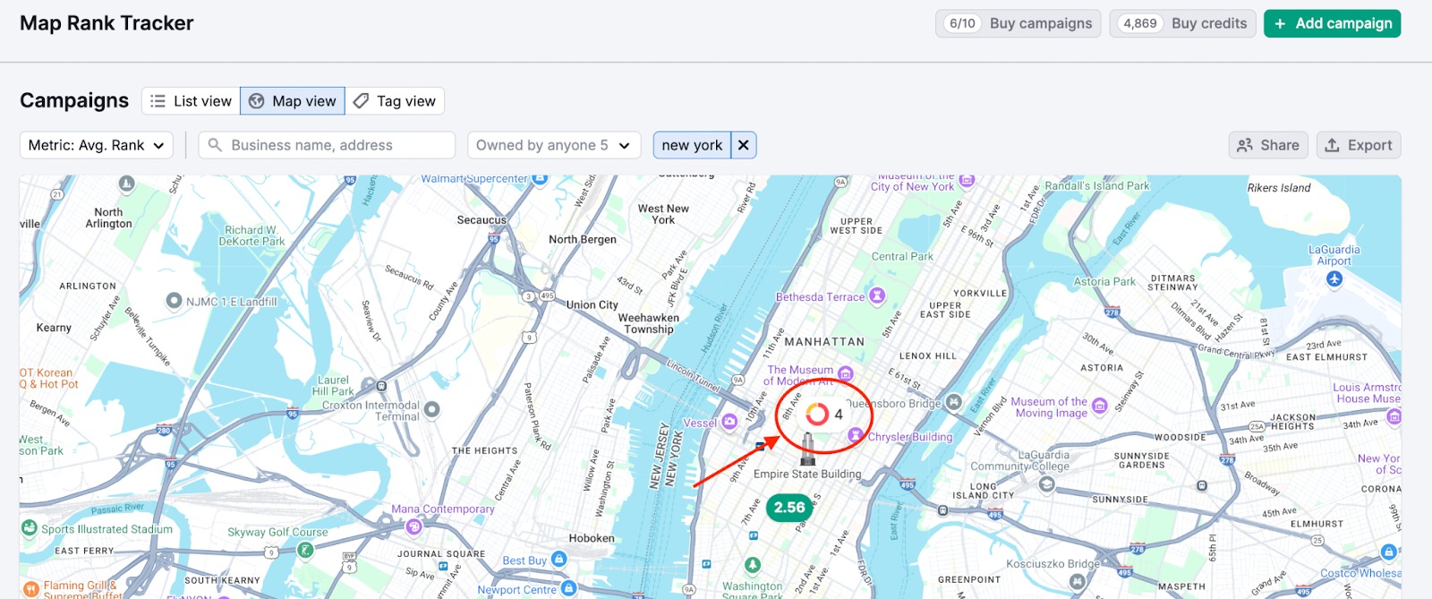
The number shows how many campaigns are in the cluster. The pie chart visualizes the distribution of their average ranks and clicking a cluster zooms in to reveal individual campaigns.